Reading knitting charts is like riding a bike – once you’ve learned, there’s no going back.
Many of the patterns we feature in The Knitter rely heavily on charts, and occasionally we have received a few letters from readers asking why some patterns don’t have a written explanation for charted sections – the answer is usually a lack of space within the magazine for our often complex designs.
If you’ve learned how to read knitting patterns but have never knitted from charts, or would like some tips to boost your confidence, this masterclass should help you.
Reading knitting charts: the basics
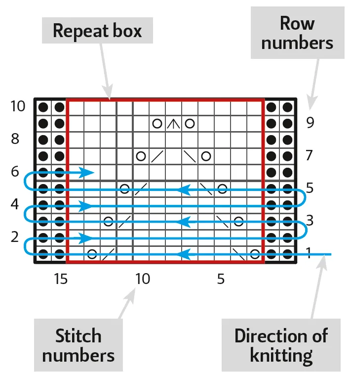
Every square in a chart represents a stitch, and these are read in the direction you are knitting if the work is viewed from the right side. You will normally start in the bottom right corner of a chart and work your way up to the top, reading from right to left on RS rows and from left to right on WS rows. When working in the round, all rounds are read from right to left.
Remembering symbols
Chart symbols are designed to remind you of the stitches they represent.
- K on RS; P on WS .This is the most common stitch, and for this reason is displayed as a blank square to make the chart less cluttered and easier to read.
- Sometimes you will see this also symbolising a K on RS, and a P on WS.
- P on RS; K on WS - this symbol is designed to remind you of a purl bump when looked at from the RS.
- Yo - shows clearly a loop is to be made.
- SSK - shows this decrease will lean towards the left.
- Skpo - another left-leaning decrease.
- K2tog - shows this decrease will lean towards the right.
- M1 - sometimes you will see an L or R in a box, instructing to M1L or M1R.
- No stitch - this stitch should be ignored and will be filled in on a later row by an increase.
Once you have learned the most common symbols, you will be well set to work your way through your first chart. And you’ll find these symbols are (almost) universal, with slight variations depending on the designer or publisher.
Repeat box
The repeat box is an essential part of a chart, and is often misinterpreted. The general rule of thumb when you see a box marked around a few stitches is to work from the first stitch to the repeat box once, repeat the stitches in the box until the last few stitches, then work the stitches after the box to the end. Some patterns with multiple sizes will tell you which stitch to start and end on, and the same rule will apply; work to the repeat box, repeat the stitches in the box, work to the stitch your size says to end with.
You may find your own methods to help you understand charts better. Maybe you remember colours better than symbols? We also recommend enlarging complicated charts on a photocopier or home printer to make them easier to read.
Our cable symbols are based on the order of stitches used to work them. Starting at the right and working to the left, each stitch within the cable is explained. This makes it simpler, and means you don’t have to keep referring to the key after you’ve worked the cable a few times.
- C2B - the cable covers two stitches and leans to the right of the work.
- C2F - the cable covers two stitches and leans to the left of the work.
- - C4B and C4F, again showing which direction they will lie.
- - Sometimes you will see cables with an extra line across them - this is also a standard representation of a C4F, and although isn’t typical of our style in The Knitter, it is common enough in other patterns to mention.
Cables get a little more tricky when they start to mix up knit and purl stitches.
- Tw2b shows that the cable covers three stitches, the ‘b’ means the yarn will be held in back, and you can see that two stitches will be lying over one stitch and leaning towards the right. The knits and purls are also in the order you would work them, so this symbol is the visual representation of “slip 1 stitch to cable needle and hold at back of work, K2, P1 from cable needle.’ Of course, this would be explained in the special abbreviations list for the pattern, but the symbols act as a quick reminder to save you referring back and forth.
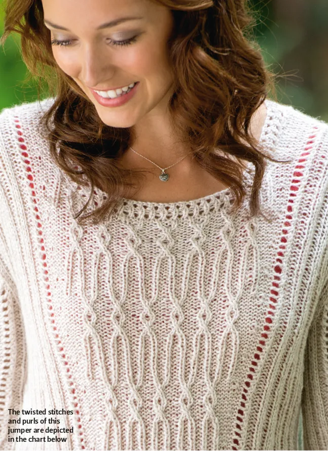
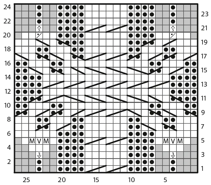
Following a cable chart like the one below, which reflects the garment pictured above, can be a great way of seeing in advance how the cables will sit, so you can catch yourself early if you make a mistake.

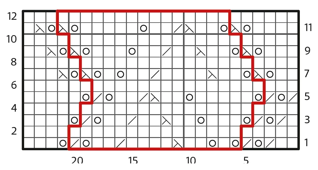
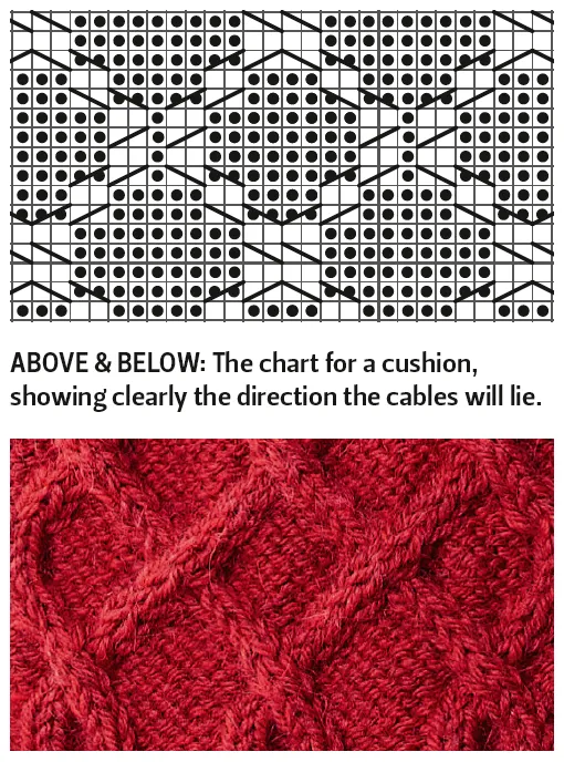
The chart below shows a slightly more complicated example, representing the red cushion in the photograph below it.
Sometimes knitters are put off by the amount of things going on in a chart and find it hard to follow. Try using a ruler, a piece of card or even a post-it note to hide the rows you haven't worked on yet, and to keep track of your progress. I load a digital version of the pattern on to my phone – I fill the screen with the chart and move it down after each row, so the first row showing at the top is the next to follow.
The 'no stitch' and counting squares
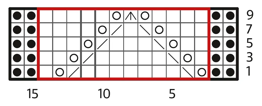
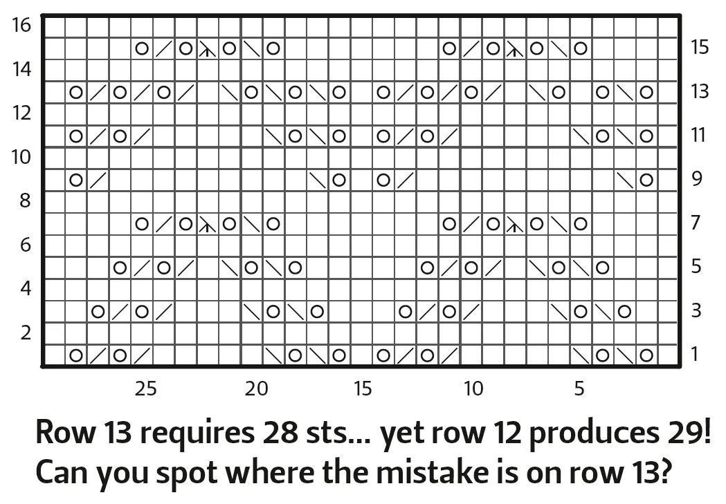
A common error when reading a chart is to count the ‘no stitch’ squares when adding up the number of stitches in a row. Often when a pattern increases in later rows, to keep the chart neat there will be a number of grey boxes in the rows with fewer stitches, and these boxes are to be ignored until they are filled in with symbols. The chart below shows a great example of this. Rows 1-3 only require 16 stitches, yet a glance the number of stitches across the bottom of the chart might be misleading - there aren’t 36 stitches in the row until you reach row 6, when all of the ‘no stitch’ squares have been filled in.
- This symbol on row 3 in the pattern below represented a double increase (making 1 stitch into 3), and the V symbol on row 5 represented a KFB, so within 2 rows the stitch count increases by 10 sts.
s
Missing out WS rows
When a pattern is worked the same on every WS row, these rows are commonly omitted from the chart completely. This not only saves space, but also gives a visual representation of how the stitches sit on top of each other to create the pattern, which can be a useful tool if you go wrong. So our example chart shown at the top of this page would look a little more like this:
And the pattern would instruct: When working chart, work Row 2 and all other WS rows as folls: K2, purl to last 2 sts, K2.
Charts are handy when you've not picked up your knitting for a few days. If you're anything like me and you don't think to mark down which row you've finished on, it's so much simpler to work out once you've learned to read your knitting and can compare it to a chart. Using the symbols to identify the first few stitches and the pattern formed by the stitches compared with the chart, you should find your place easily.
Reading your knitting
Understanding charts is the next step in reading your knitting; decreases and cables clearly show which way they lean, and you can see what the knitting is supposed to look like at a glance, as the chart gives you a picture of which stitches sit on top of others when working in pattern. You can also see where increases and decreases are balanced, in lace work for example, which makes it easier to apply shaping in pattern without making mistakes.
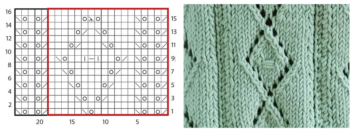
The chart and image above are a nice example of left- and right-leaning decrease symbols representing the stitches. Instead of following a string of instructions, such as: Row 1: (K2tog, yo, K1, yo, SSK, K6, yo, SSK, K5) xxxx times, K2tog, yo, K1, yo, SSK, the knitter can simply glance at the chart and see where the pattern is going next.
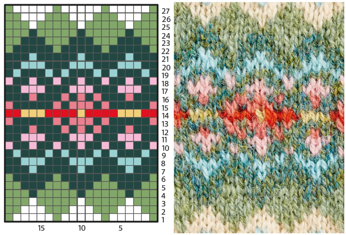
Working Fair Isle charts
Fair Isle charts are the easiest form of chart, and a good place to start practising if you find symbols daunting. As you can see from the example below, the chart clearly shows what the pattern is going to look like, and is much tidier than the written instructions for this pattern would be. This chart is also worked in the round, which is why all the row numbers are on the right-hand side.
Shaped charts
Sometimes, instead of showing ‘no stitch’ boxes, a chart will require shaping to hide stitches that have been decreased for the remainder of the pattern, or to show shaping in the pattern.
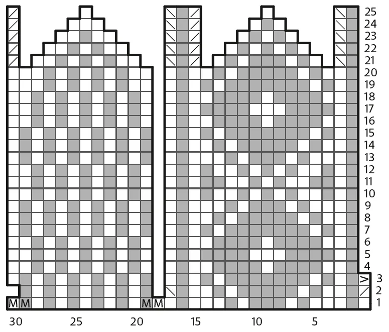
The chart above shows the thumb section of a Fair Isle (two-colour) mitten. The grey squares in this chart actually represented the colour of one of the two yarns used in the pattern. This chart doesn’t look dissimilar to a mini-version of a mitten chart, which would quite commonly be displayed in this way. You will also see similar charts to this which show the shaping at the top of a hat.
As you can see on round 2, there are two decreases, resulting in two stitches being ‘cut away’ from the pattern outline. The symbol at the beginning of round 3 instructed the knitter to slip this stitch to the end of the round and move the marker, which accounts for the shape going in on the right and back out again on the left on the following row.
The pattern is then worked straight until round 21, when shaping will occur at each side of the thumb, where the stitches that have been decreased have been removed from the chart. If you imagine you were to cut around this chart, fold it in half and fold the straight sections in to the point in the middle, you would end up with a rounded tube with the top squeezed in - just like the thumb of the mitten.
Once you've mastered the art of knitting by following charts, a whole realm of possibilities will emerge! I keep a pad of graph paper on my desk to check patterns, but when I get an idea for a stitch pattern, it's useful to be able to scribble it down right away. Have a play with colours and symbols and see what you end up with, or have a go at adapting some of the ones we've shown in this masterclass.
Size outlines
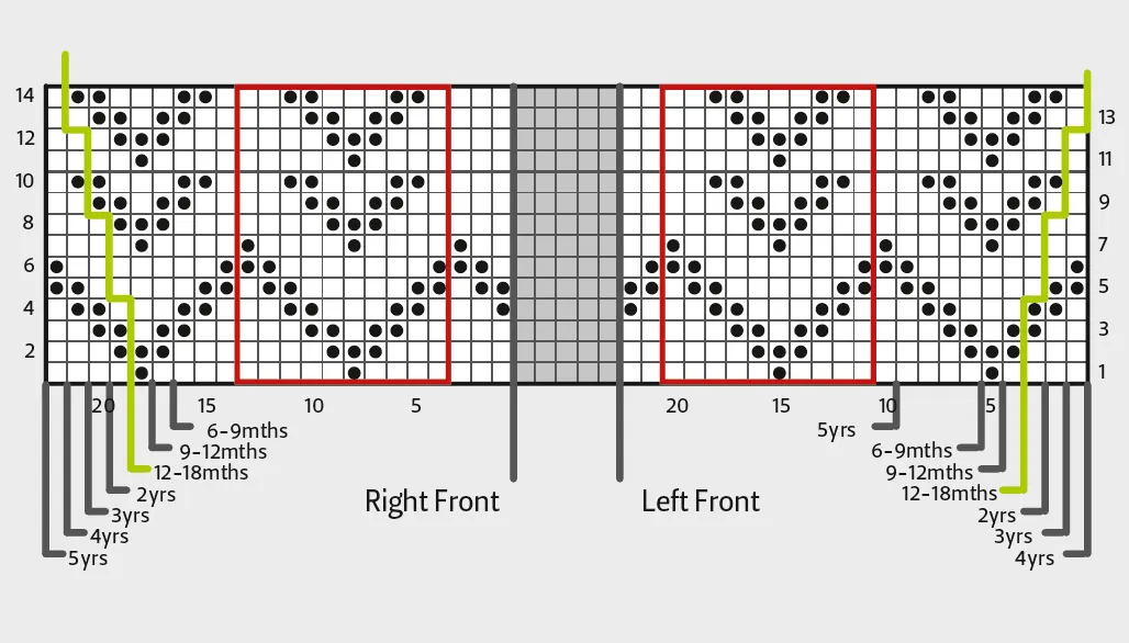
Sometimes a chart will have size outlines on it, like the one pictured above. Our example here shows the Left Front and the Right Front. If you were working the 6-9 months size, to work the Left Front you would begin on stitch 6, work the first 5 stitches before the repeat box, repeat the stitches in the box to the last 2 stitches, then work the two stitches after the box before the grey section in the centre. Then, to work the Right Front you would begin on stitch 1 of the Right Front section, work your repeats, then end on stitch 16. Often you will see shaping lines on the chart, like the ones we’ve marked here in green. Usually these will reflect the written pattern, which in this instance would instruct to increase 1 stitch at each end of the 5th row, then every following 4th row, two times.
Confirming an error
Charts are useful in those inevitable situations where something just isn’t quite right. Here are some steps you can take if you think you've found an error.