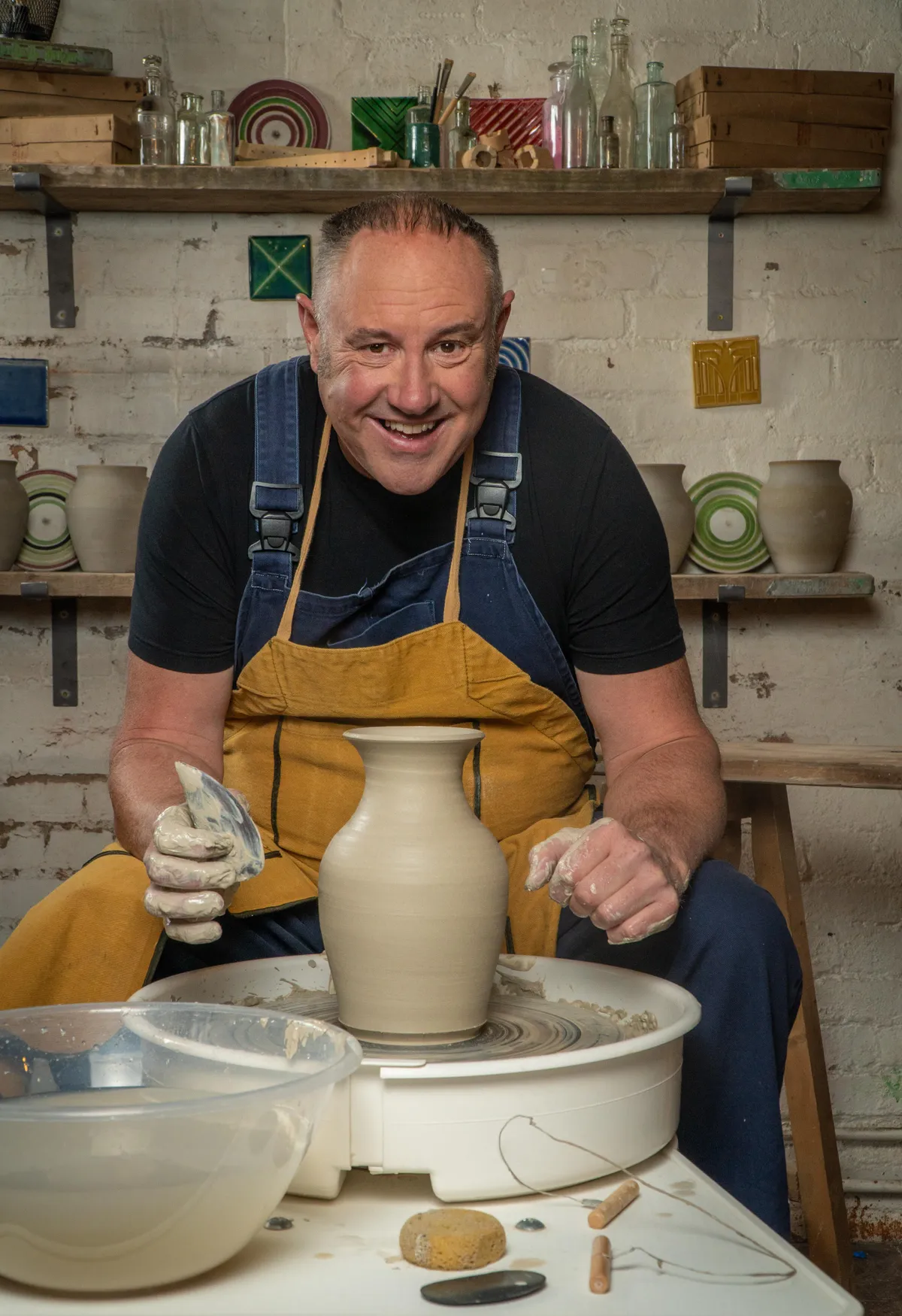
Interior Design Masters series 5 is back on our screens and we've got all the gossip about the latest season right here!
Catch up with the series with our episode guide, learn more about the judges, and get creative interior design inspiration below!
Looking for more creative TV shows to watch? Check out our craft TV guides to the Great Pottery Throwdown, the Great British Sewing Bee and The Repair Shop.
Featured image by BBC/Darlow Smithson Productions.
What is Interior Design Masters about?
If you're a creative person who loves to watch home renovation shows, then you're guaranteed to enjoy Interior Design Masters – it's the perfect mix of crafting, DIY and interior design. And, of course, it's a competition with a prestigious prize in store for the winner.
Each week the contestants are asked to make over a new venue and past series have included restaurant makeovers, shop interiors and even beach hut redesigns. For some challenges, the contestants are split off into small teams and for others they must work separately.
It's often a real test of their team working and communication skills, which are essential for anyone who wants to be a professional interior designer. It's a competitive show, but often the best designs are the result of a successful collaboration between the contestants.
What channel is Interior Design Masters on?
Interior Design Masters is shown on BBC One and is available on iPlayer.
What time is Interior Design Masters 2024 on TV?
Interior Design Masters 2024 begins on Tuesday 12th March at 8pm on BBC One.
Where to watch Interior Design Masters online?
You can watch Interior Design Masters on BBC iPlayer after the show has aired on BBC One.
Where can I watch past episodes of Interior Design Masters?
Series one is currently available on Netflix, but we have no information on when series two will be added. Series two to five are all available on BBC iPlayer.
Where is Interior Design Masters filmed?
The challenges are filmed in a variety of locations around the UK, but the show is based in a beautiful design hub in Brighton.
Who won Interior Design Masters 2023?
Monkia Charchula won the Interior Design Masters 2023 crown! It was well deserved and we loved seeing her confidence grow week after week.
She received an outpouring of love from the general public for being so honest about her ADHD.
Never in my wildest dreams did I think this would happen? This is the start of something new, something big!
Monkia Charchula
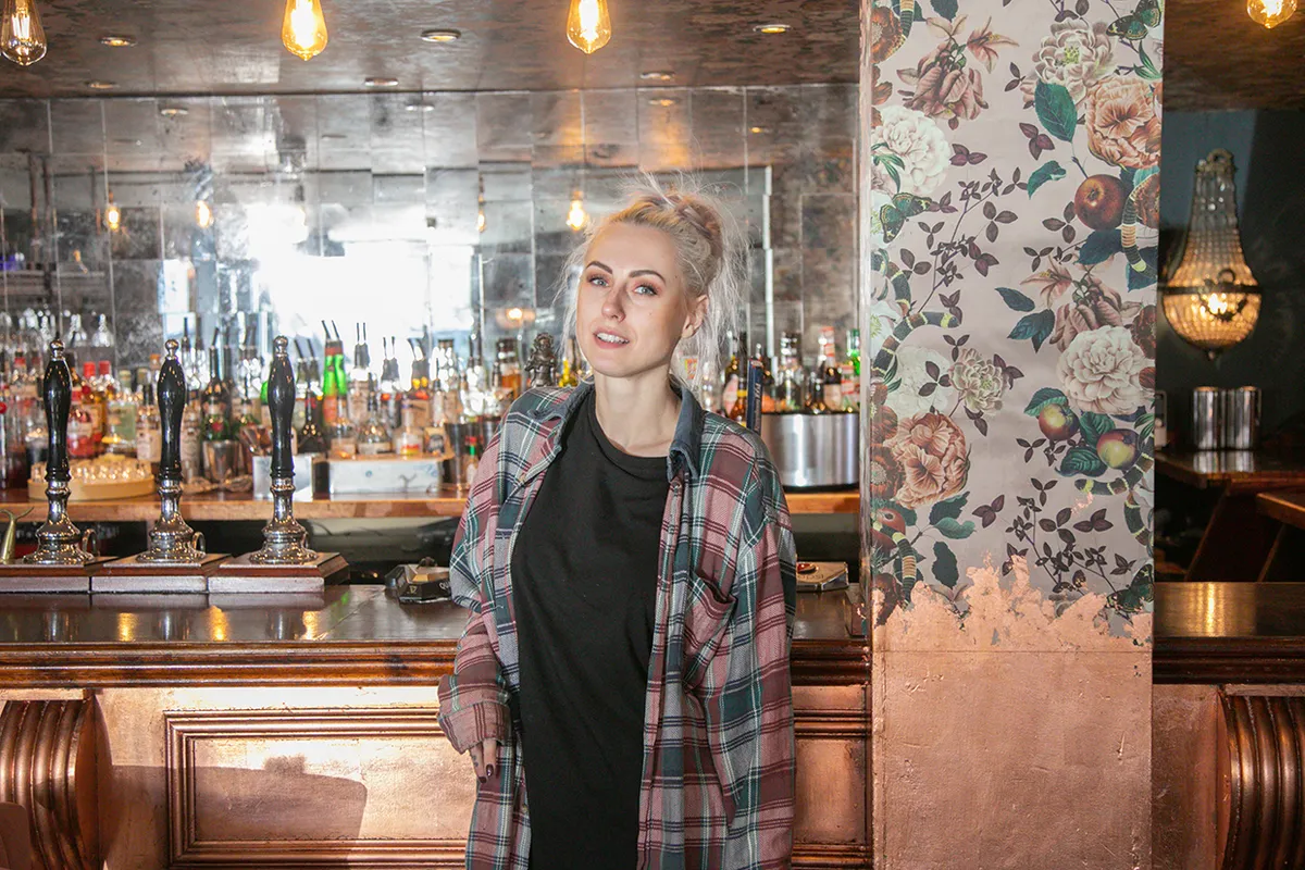
Interior Design Masters series 5
The brand new batch of aspiring designers will be put to the test in a series of challenges, from turning nun's cells into B&Bs to transforming Wembley dressing rooms. They'll visit different destinations around the country and will need to impress Michelle Ogundehin and the guest judges with their creative skills each week.
Those on the losing team will have to sit on the couch and explain their design decisions to the judges – with one contestant being sent home each week. We can't wait to see what spaces the contestants create and decorate this year!
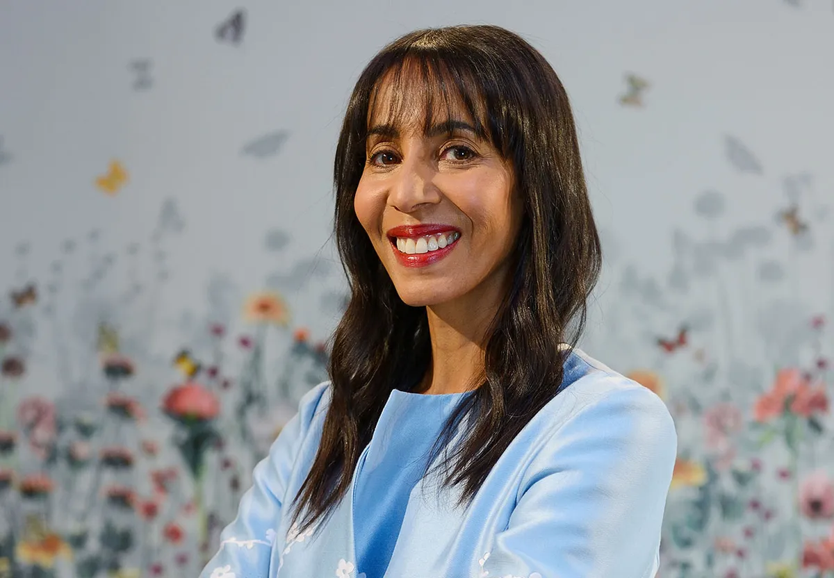
Interior Design Masters 2024 judge Michelle Ogundehin
The main judge on the show is Michelle Ogundehin, who is the former editor-in-chief of Elle Decoration. She's both a judge and mentor to the contestants and loves to see their skills develop as the series progresses. She describes her judging style as "firm but fair".
So, what can we expect from the new series? "Tears, joy, inspiration, disasters, incredulity, and a lot of passion and effort. Our designers work incredibly hard, because each and every project is everything to them!" she says.
As usual, Michelle has high expectations of this year's fresh crop of designers. "Most of all, I’m looking for people who are open to learn," she says. "People with a can-do attitude and a unique point of view. I can only bring out the best in someone who's prepared to accept that they don't know it all already."
"Also, the best designers, whether just starting out, or firmly established, recognise that they are first and foremost in service to their client.
"It's so easy to fall into the trap of defaulting to old tropes or personal must-haves, but if it's not appropriate to the scheme, location, purpose or brief, then you have to be big enough to change it. That said, passion also goes a long way, as does enthusiasm!"
Michelle's staying tight-lipped about her standout design from the new series. "It would be like picking a favourite child, so no, I couldn’t possibly choose only one," she says.
Find out more about Michelle Ogundehin by reading her interview with YourHomeStyle.

Interior Design Masters 2024 presenter Alan Carr
Comedian and TV presenter Alan Carr took over as the host of Interior Design Masters in series two. The show was previously presented by Fearne Cotton.
Alan is best known for hosting Alan Carr: Chatty Man, but has also made appearances on comedy shows such as Ru Paul's Drag Race UK and 8 Out of 10 Cats Does Countdown.
He's very excited about this year's designers: "The key to the show's success is the designers, it’s getting the right mix, not just of personalities but design styles. This year does not disappoint: we have quirky designers, serious designers but the one thing they have in common is that they are designers who are just starting out.
"On this show you always think that you’ve seen everything and then a designer comes along with something so uniquely beautiful, or in some cases hideously awful, but you are always surprised whether in a good way or bad!"
Alan Carr is brilliantly supportive of the contestants on Interior Design Masters, but how does he resist the urge to share his opinions? "I have to bite my tongue so badly, but then I do have the worst poker face, so I end up saying it anyway.," he says.
"The series has been going on so long now that I think the designers can tell whether I like it or not. They’ll say ‘you hate it don’t you’ and I have to come clean. But in my defence if I LOVE a design I will gush accordingly."
Interior Design Masters 2024 contestants
Get to know this year's aspiring designers and prepare to cheer them on!
Anthony
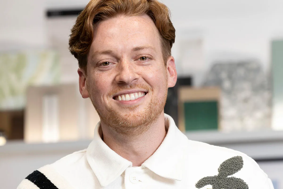
- Lives in London
- Stay at home dad/interior stylist
- Style: Colourful traditional
Anthony is former musical theatre actor turned full-time dad. He performed in hit musicals such as Joseph and the Amazing Technicolor Dreamcoat and toured the world with Evita. In 2020, he stopped performing in order to start a family.
With the help of his builder dad, Anthony transformed a rundown house into a family home before adopting a baby with his partner. The project inspired Anthony's love of interior design and he later went on to makeover his partner's new restaurant.
He now works as a freelance interior stylist, as well as styling the artists' dressing rooms for events such as the Brit Awards and Eurovision.
Ash
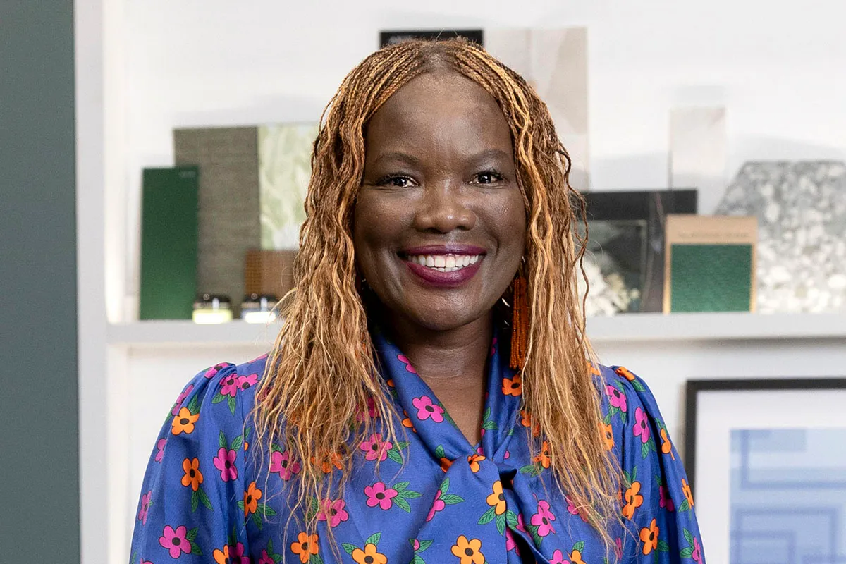
- Lives in London
- Interior therapist
- Style: Africa modern
Ash was a diplomat's daughter, so she spent time living in Bonn, Stockholm and London before returning to Nairobi in her teens.
She initially embarked on a legal career in Nairobi which led her to a career in international diplomacy and sustainable development. She also worked on the side as a documentary photographer for the likes of the UN, various international organisations and charities.
Renovating homes in Nairobi she realised that the commonly perceived African aesthetic was often limited to ‘tribal’ or ‘safari-style’ which didn't align with her vision. Ash draws inspiration from the pulsating energy and spirit of modern Africa and she aims to anchor her spaces in joy, colour, resourcefulness, whimsicality, art and craftsmanship.
A few years ago Ash started a website and YouTube channel to showcase her apartment renovation. She now styles herself as an ‘interior therapist’ aiming to create spaces for her clients which celebrate African heritage and make people happy at home.
Ben
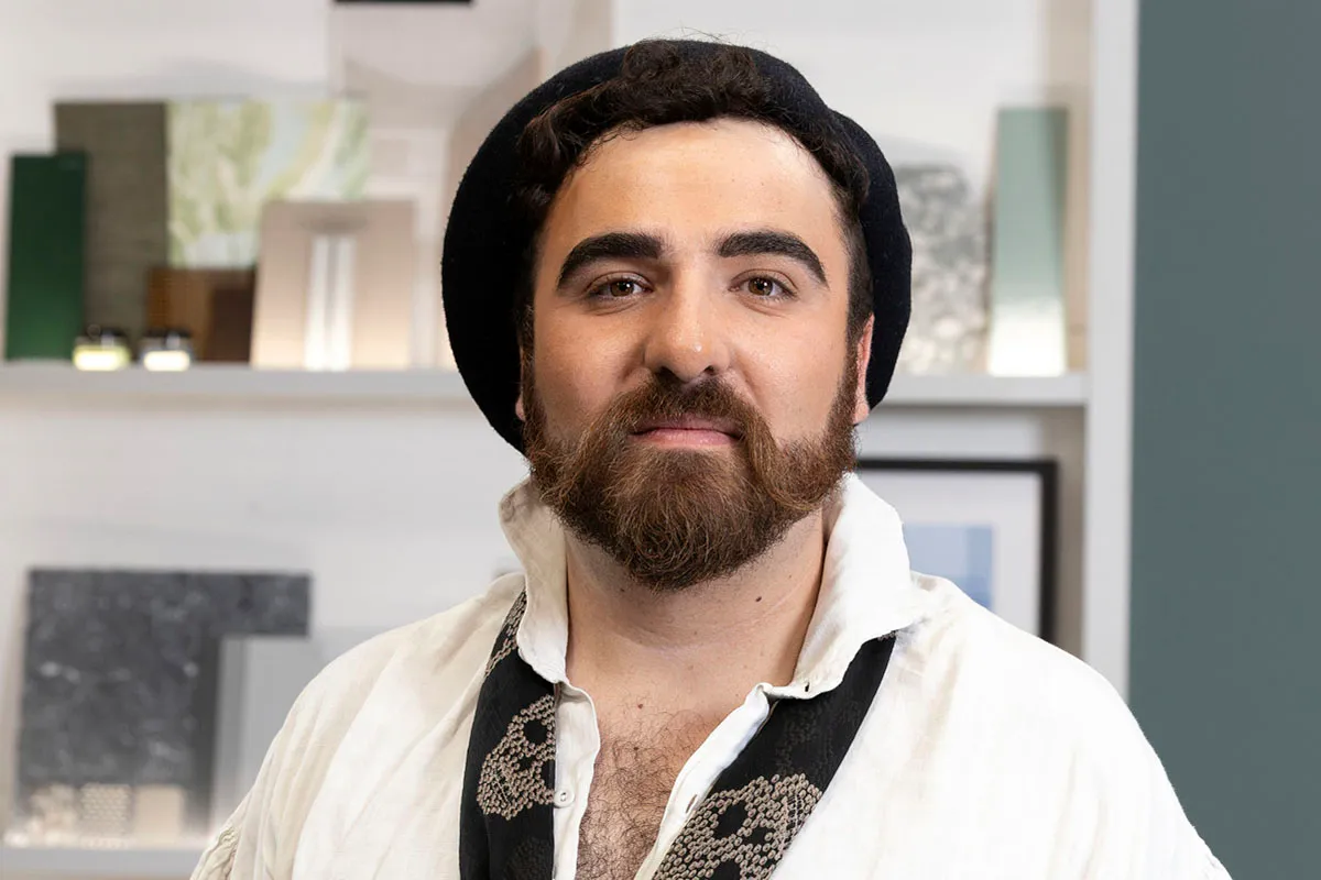
- Wolverhampton
- Lingerie designer
- Style: Victorian maximalist
Ben grew up in San Sebastián, Spain, and now resides in Wolverhampton with his history professor partner. He's obsessed with Victoriana and says he has the soul of a 97-year-old grandma.
Ben's love of history is reflected in both his clothing and his interior designs. As a child, he was fascinated by the Edwardian era and later became a hoarder of antiques. Many of his flea market finds can still be found in his home, such as a French horn that he transformed into a lampshade.
His grandmother taught him how to sew, and from here his interest in creating clothing and fashion grew. He studied fashion in Madrid and gained a Masters in furriery and lingerie at Central St Martin’s in London before designing clothes for Film and TV.
He later went on to manage a boutique in London’s Portobello Road dressed serving customers dressed head to toe in Victorian clothing. Ben now works as a sample cutter for a well-known lingerie company.
Domnall

- Derry/Londonderry
- Illustrator, artist and shop owner
- Style: Graphic Mid-Century Modern
Domnall was brought up in Derry. He studied illustration at university and got his first job as a graphic designer at a local newspaper until his career took him to Belfast, Sydney and London.
He returned home in 2009 and as an artist, exhibited his work in Northern Ireland providing social commentary in a contemporary pop art style. In 2013 he was commissioned to create an iconic wall mural as part of his hometown’s City of Culture status and his winning design was chosen for the official mascot of that year too.
Domnall opened a studio shop in 2015 selling a range of reclaimed and upcycled furniture, original artwork, prints, fabrics designs and jewellery.
He began to produce artwork and murals for local businesses and has also worked on a variety of interior design projects in his hometown, for which he supplied bespoke furniture and artwork. He's written and illustrated children’s books too.
In 2023, Domnall completed his most sustainable interior design project to date-designing a bar and restaurant for the Millennium Forum Theatre in Derry. Domnall is eco conscious in his designs and prefers using sustainable, non-toxic materials, such as pineapple leather and he sources and refurbishes preloved furniture.
Francesca

- London
- Textiles maker and teacher
- Style: Playful colourist
Francesca lives in East London with her husband and their 2-year-old son. She is a crafts teacher and has taught children with special needs in her local community.
As a young child growing up, she recalls poring over her mum’s interiors magazines picking out things she’d have in her future home. In her early teens, her favourite pastime was to collect free colour paint cards and spend her time printing off floor plans from estate agent’s website to redesign the rooms.
After visiting her sister who was living in Japan in 2016, Francesca imported some Saori looms and on her return founded London’s first ever drop-in weaving studio which offered a variety of textile and craft classes, events and talks and she also wrote a book about weaving.
During the pandemic, Francesca decided to focus on renovating her flat and starting a family. Her home renovation gained a good following on Instagram as people appreciated her fun, playful and mischievous style.
As well as teaching crafts she takes on freelance sewing commissions and has started attending an upholstery course. Now she is coming out the other side of having a baby, she wants to re-forge her career in interiors.
She would ultimately love to run her own interiors brand with a workshop to make and design products and be an advocate for sewing and crafts.
Hannah
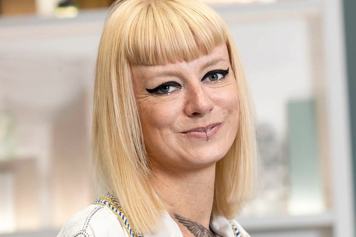
- London
- Interior designer
- Colourful Brutalist
After studying a foundation degree in Art and Design at university, Hannah embarked on a 20-year career in fashion visual merchandising. She worked her way up from the sales floor in a little shop in Leicester, to managing the European creative team for a global brand. She ran a production workshop, managing a team of builders who installed her shop window designs around Europe.
Hannah left retail fashion when the pandemic hit, and she made the decision to pursue her long held ambition to become an interior designer. She signed up for a diploma in interior design and alongside her studies did a few unpaid makeovers for friends to build up her portfolio.
From a modest start upcycling plant pots and vases, Hannah set up her own homewares business, selling cast cement pots and vases through shops across the UK.
Hannah has redesigned her own flat, a handful of other residential projects and an office so far but has dreams of designing mid-century homes and hotels.
Jess

- Margate
- Upholsterer
- Memphis-inspired mid-century
Jess moved to Margate after she joined the events team at Dreamland theme park. At the same time, she started a part time upholstery course as a hobby.
Her hobby for upholstery quickly became her passion so she quit her job and set up her own upholstery studio with a friend. Since then, Jess has upholstered hundreds of items and collaborated with interior designers across the UK. J
ess loves taking on ‘weird and wonderful’ upholstery challenges and her most challenging project to date, has been entirely covering 19 ceilings with upholstery in a local hotel.
Jess is also a co-owner of a popular gay bar in Margate which she bought with her brother, girlfriend and two best friends. It went from a disused computer shop to a late-night bar which Jess designed in the Memphis style.
Jess loved every part of the project and it cemented her love for interiors. Now she has just bought her first property and cannot wait to get stuck in with the re-design.
Matt

- Cheltenham
- Bathroom designer
- Style: Elegant Brutalism
Matt is originally from Cheltenham and grew up with a passion for art and design, partly due to his father’s job restoring Japanese antiques. He was always happiest as a child when being creative and using his hands and at aged 16, he received a school award for innovation for product design.
Following school Matt gained an extended diploma in Art and Design and went on to do a BA degree in Interior Architecture. He spent a year studying in Barcelona and during the summer worked with his dad restoring furniture. Matt is now back living in Cheltenham and currently works as a bathroom designer for a local company.
He is inspired by Brutalist architecture and design and loves working with light and shadow to create interesting design. His ambition is to open his own commercial design practice and his ultimate dream is to design a fashion catwalk in collaboration with a fashion designer.
Roisin

- The Wirral
- Former travel advisor
- Colourful maximalism
Roisin is originally from the Isle of Man. She moved to Liverpool to study Drama and during her summer holidays would work for camps in America as a lifeguard where she met her now husband. Her summer job led to her becoming a travel advisor and she has travelled the world extensively. She got married last year and lives in The Wirral in a house she has designed and renovated.
When Covid hit, Roisin and her husband decided to stay with her parents on the Isle of Man as they were in the process of building their new home. Roisin took over as their interior designer and project manager liaising with the architects and tradespeople to make her vision come to life.
In 2022 after some encouragement from her work colleagues who were always asking her for Interior design advice, Roisin set up an interior design Instagram account to document the transformation of her parents’ home and gained a following.
As soon as she found out she had a place on Interior Design Masters, Roisin quit her job and now wants to pursue her dream career of being an interior designer. Her ultimate dream would be to design an entire boutique hotel.
Sheree

- Margate
- Copyrighter
- Colourful Scandi
Sheree is originally from Leeds and grew up in a creative family home. Her Jamaican father is a musician and her Danish mother always encouraged her and her two siblings to give everything creative a go – art, crafts, music and writing.
Being half Danish and half Jamaican, Sheree has been influenced by both Scandi and Caribbean interiors and now loves to incorporate both styles within her own designs. Sheree’s mum renovated their family home which sparked Sheree’s interest in interior design and she fondly remembers coming home from school and taking on DIY challenges with her.
After university, Sheree moved to London to pursue a career in journalism. She became a copywriter for various retail stores and now manages a team who work on the companies’ marketing campaigns, adverts and websites.
She currently lives in Margate, in a newly purchased Victorian terraced house which she’s renovating herself. This big project has allowed her to put to into practice her interior design style. Sheree’s gained so much enjoyment from doing up her own home, she now wants to embark on a career as an interior designer.
Where to follow the Interior Design Masters contestants
Want to keep up with your faves throughout the series? Here's where to follow them on Instagram:
- Anthony – @anthonyraydesign
- Ash – @anafricaneye
- Ben – @bygoneben
- Domnall – @smartswagdesign
- Francesca – @francesklondon
- Hannah – @hannah_drakeford_design
- Jess – @jessicadupreezdesign
- Matt – @matt.smithwood
- Roisin – @roisinquinn
- Sheree – @chez.shez
Interior Design Masters series 5 episode guide
We'll update you with regular highlights from each week's episode here. Tune in each week for fresh updates!
Episode one
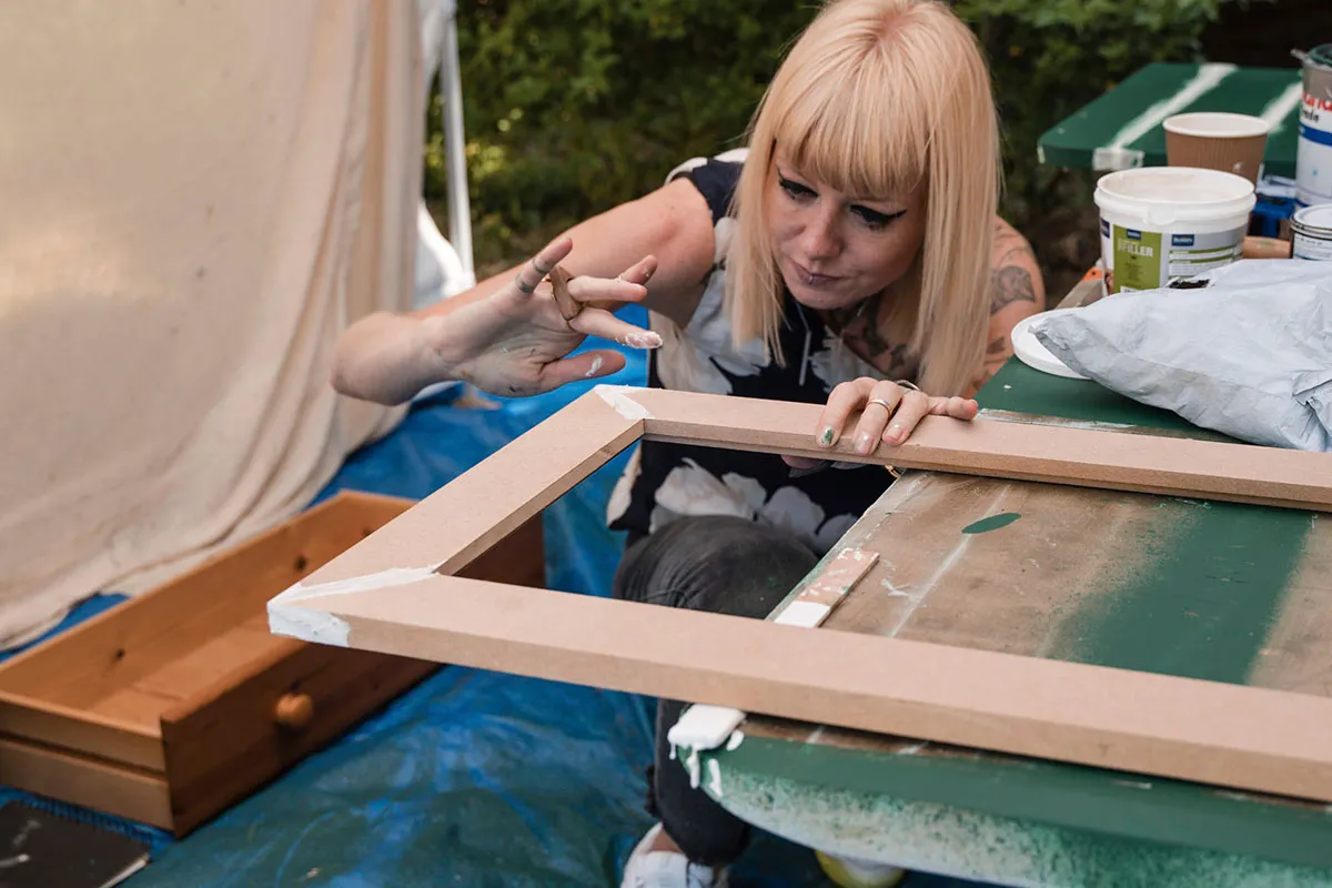
Interior Design Masters is a show that really likes to challenge its contestants and its judge, Michelle Ogundehin, has high expectations of the designers.
"Interior Design Masters is like the most intense, immersive crash course in interior design," she said. "So I'm looking for that person who's just going to take the ball and run with it." No pressure!
Interior Design Masters doesn't like to ease the contestants in with a simple project. The designers were brought to a former convent in Norfolk, which is now run by a charity that supports homeless people to get back on their feet. They were asked to transform tiny nun's cells into B&B accommodation.
As it was the first challenge, Michelle Ogundehin was looking for the contestants to give her a flavour of their personal style, while keeping in mind the needs of the client. She wanted them to consider what a guest might need, while coming up with the kind of room that would make the convent a destination stay. No pressure!
As an added challenge, Michelle asked the designers to choose an item from the charity's antique furniture store to upcycle as part of their interior decor.
Highlights: Each room had a sink that needed to be incorporated into the design. Ben cleverly hid his inside a refurbished wardrobe!
Lowlights: The judges felt Sheree's Sound of Music-themed room was underwhelming and lacking in texture, so she was the first designer to leave the show. Anthony was also told off by Michelle for including a sexy nun poster in his design, as she felt it was inappropriate.
Episode two
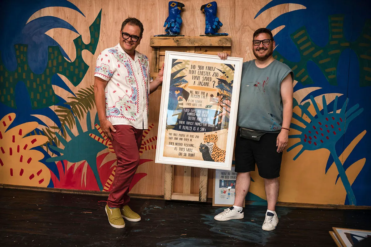
We're off to the zoo! Every series of Interior Design Masters features a child-themed challenge and this time it's the turn of Chester Zoo.
With a budget of £3,000 and a two-day time limit, the designers were asked to transform activity centres aimed at kids Each team of three had to design a space themed around a different part of the world: Brazil, India or Madagascar.
Michelle warned the designers not to make their rooms too childish. "The hardest bit of this challenge is the fact that they have to pitch their schemes to and age range from five to 16. And that is going to be complicated, because it can't all be primary colours and big shapes," she said.
Teamwork and collaboration are important skills that every interior designer should have – and it's often where talented designers struggle, as they have to compromise their vision.
Ash admitted to feeling nervous about that aspect of the challenge: "It's about the joint result and if it doesn't work then we're all on the sofa.
Team Brazil seemed to come up with a design that worked well, without feeling too childish. Hannah even incorporated Domnall's fabric prints into her seating to give the room a harmonious feel. We loved her inventive lily pad floor cushions too.
Meanwhile, in the Madagascar room Anthony, Roisin and Francesa were adding their own unique touches. They ingeniously added buttons to the walls that played animal noises when pressed.
The judges were also very impressed by their leafy ceiling canopy and clever use of storage, but worried that the overall look wasn't mature enough for teens.
Unfortunately Team India struggled to create a design that flowed and the judges felt that the room was unfinished. In particular, Jess struggled as her technical skills were in high demand, leaving her less time to complete her seating areas.
I am going to fight like a lion on that sofa. I deserve to stay here and I am going to stay here
Ben
Highlights: Domnall took his room design to the next level by writing a poem and framing it, surrounded by his own illustrations.
Lowlights: Team India struggled to create a unified design, which meant that Ben, Jess and Ash ended up on the sofa facing Michelle.
Episode three

This week, we're off to the races! The designers were taken to Royal Ascot to transform some of the race course's private boxes.
The race course was looking for luxurious hospitality suites for their visitors. The designers had two days and a £2,000 budget to create their own glamorous designs.
They had a demanding guest judge to impress this week: multi-award winning designer Kelly Hoppen. Matt was particularly nervous about this, as he's a big fan of Kelly's style.
The designers had good reason to be nervous, as this was a double elimination week with two designers leaving the show.
As usual, the designers took their interiors in completely different directions. Anthony was inspired by Royal Ascot's ceremonial 'green coats', who assist guests at the races. His space was dark green with a luxe feel.
Meanwhile, upholsterer Jess was inspired by the NYC drag scene in the 1980s. She wanted to reflect the fact that Royal Ascot has recently updated its dress code to allow for trans and non-binary racegoers.
Ben was as theatrical as ever, coming up with a bold design inspired by My Fair Lady. The highlight of his room was a striped ceiling painted to give the illusion of standing inside a tent. This clever optical trick made the room feel more spacious.
Ben planned to use a trellis in his room – and he wasn't the only designer bringing a trellis into his design. Roisin had bought a trellis to use in her luxury summerhouse-themed space.
I'm slightly worried simply because Roisin is also doing the trellis. This is not a case of jealousy, but what if her interpretation is much more clever and much more beautiful?
Ben
Francesca's room featured kitschy black and white flooring and soft baby blue walls, creating a look that was fresh and inviting.
Like Anthony, Matt also took his inspiration from Royal Ascot. He covered some of his wall panels with designs inspired by the jockeys' silks to add colour to the room. Matt also cleverly framed the view with dark panelling, bringing more attention to the race course outside.
The judges praised Matt, Anthony, Francesca and Domnall, putting them through to next week. However, Michelle warned Domnall not to rely too heavily on his graphic design and illustration skills.
That meant that Ben, Roisin, Hannah and Jess had to face Michelle and Kelly on the sofa to explain their design choices.
Highlights: Matt seemed very moved to receive praise from Kelly Hoppen for his design.
Lowlights: Sadly, the judges didn't love Hannah's geometric design or Jess's 1980s disco theme, so they both left the show this week.
Episode four
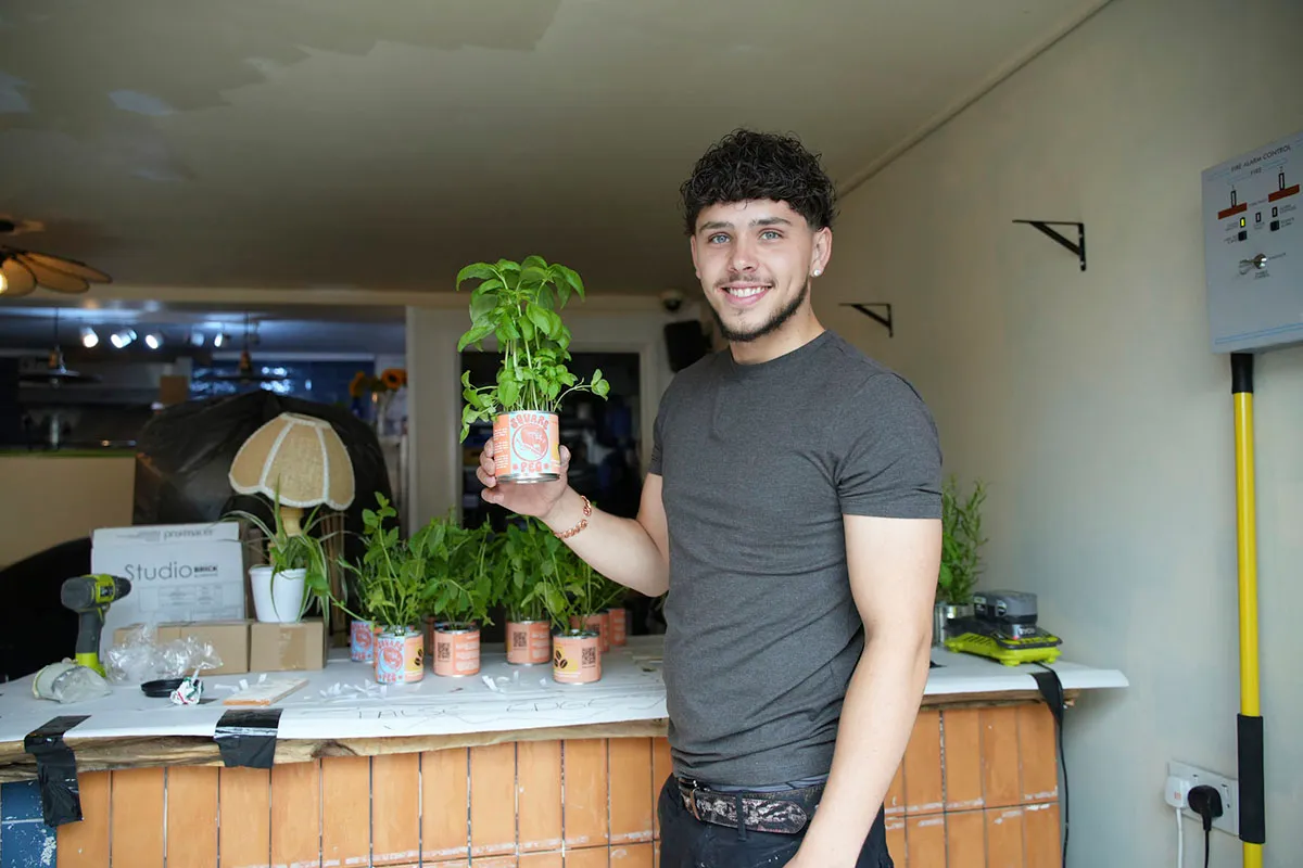
This week was one of our favourite challenges: redesigning cafe interiors! The contestants were paired up and sent off to Swansea to transform three indie cafes with a budget of £3,000.
This was the first opportunity for the designers to meet a client and receive a brief. Michelle wanted to see how their designs met the clients' needs, but this challenge was also a test of the designers' collaboration skills. "Teamwork is going to be everything in this challenge," she said.
Francesca and Domnall wanted to create a cohesive design with colour and excitement. Their chosen theme for the cafe was "Scandi by the sea".
However, it wasn't long before the cracks began to show. Domnall wasn't keen on the pale pink colour Francesca had chosen for the walls, while Francesca felt that Domnall had been secretive about his plans for the bar.
Meanwhile, Anthony and Ben seemed to be on the same page and complemented each other well. They separately came up with the same colour palette for their industrial-inspired cafe, Y Shed. They took on board the cafe owner's needs and brought their own unique flair to the cafe.
Their theme featured corrugated metal on the walls and fake rust-effect pillars, softened by an abundance of greenery.
Matt and Roisin have very different tastes and styles, but they came together to produce a surprisingly harmonious design that impressed the judges. They created a cafe interior that Michelle described as a "joyous, warm, friendly, space". It's not surprising that they won space of the week!
I feel like a hobbit talking to the queen of the elves!
Guest judge Nisha Katona was unimpressed by the varying seating heights in Domnall and Francesca's cafe
Highlights: Roisin's unusual measuring technique! She used her own back to gauge whether the seating was the correct size.
Lowlights: It was an emotional time on the couch as Domnall and Francesca faced the judges. Sadly, it was Domnall's time to leave the show.
Episode five
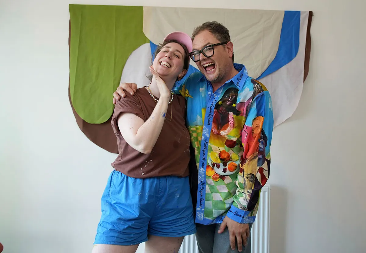
The contestants have been whittled down to five and this week the budding interior designers were competing for a coveted spot in the quarter-finals.
This week, it was the apartment challenge and the designers were asked to create show apartments to impress young professionals in Sheffield. Michelle asked them to come up with designs that would be easy for renters to remove when their tenancy ends.
Anthony decided to take a risk and save some of his budget by keeping the original furnishings, working around them. He used some clever shortcuts, such as stick-on tiles, to give his kitchen a speedy makeover.
In an effort to go above and beyond, Anthony conducted his own market research and spoke to young professionals in London to see what they really wanted from an apartment design. He incorporated their feedback into his design, making an attractive window space for working from home and using removable splashbacks attached using velcro.
Ben went for a bold Modernist design influenced by the Bauhaus movement, highlighting his space with bright blocks of colour.
Francesca was also inspired by Modernism and filled her apartment with Matisse-style shapes and cutouts. Like Ben, she painted her hallway in a vivid blue shade. Perhaps they've been spending too much time together?
Meanwhile, Roisin wanted to create an atmosphere that felt welcoming and homely. She was very focused on the fact that she wanted to make everything removable and temporary.
Roisin chose to paint her ceiling in a warm olive green, making the kitchen and living room areas feel like a unified space. Alan picked up on the fact that Roisin was once more including green in her colour scheme, asking her why she was so attracted to the colour. She said she felt it was inviting.
She's gone green more times than The Incredible Hulk – I want to see something else!
Alan Carr
In the end, Anthony and Ben were put through to the semi-final with Matt, Roisin and Francesca facing Michelle on the couch to defend their design choices.
Highlights: The judges were impressed by Anthony's attractive design, which made use of the existing furnishings. He won Space of the Week!
Lowlights: Francesca became obsessed with adding wavy lines to her apartment and removing harsh lines, but the judges felt that it made her design look too childish.
Episode six
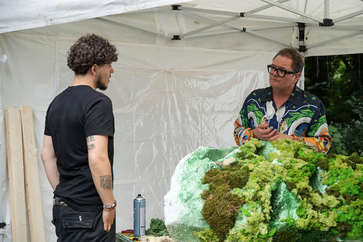
Retail Week is one of our fave Interior Design Masters themes, as it really puts the designers through their paces!
And the designers had to work hard this week to impress this week's guest judge: high street champion Mary Portas.
The remaining designers headed to the historic high street of East Grinstead to makeover Grade II-listed independent shops.
Michelle paired Roisin and Anthony to work on a women's fashion shop, with Ben and Matt tasked with decorating a crystal store next door. She said it was up to the teams how they divided their work, but reminded them that they needed to think of the needs of the owners, the customers and the products.
Designing a shop, I think, is a bit like the art of seduction. You've got to entice your customer in
Michelle Ogundehin
Next it was time for the designers to meet their clients. The women's fashion store requested a more industrial feel and wanted to have an attractive window display to bring the customers in. Meanwhile, Matt and Ben immediately identified that their store had a real issue with lighting and how the space was used.
Working in Grade II-listed shops meant that there were a few restrictions that the designers had to abide by. For example, the historic beams couldn't have anything attached to them and the shop fronts had to be painted in black and white. However, the designers skilfully worked around the strict rules to make stunning designs.
Roisin chose a mottled wallpaper to decorate the walls and ceiling of the fashion store's first floor – and was happy with her choice until Ben said it looked like there was water damage in the walls! Luckily the judges disagreed and thought it suited the space.
Anthony was worried that Roisin's wallpapering needs were taking up too much of the decorators' time, leaving him less time to decorate the downstairs room. He focused on colour drenching the space in a deep green and making bespoke storage to display the shop's vibrant array of handbags.
Meanwhile, Matt set himself a real challenge by choosing to make some realistic mossy mountains to display the crystals. This involved covering a carved polystyrene base with little scraps of moss – by hand. This task took him most of day one to complete.
Upstairs, Ben worked to make a build-your-own terrarium room on the first floor and the top floor was transformed into a mystical grotto with glowing crystals!
At the end of the episode, the judges named Ben and Matt the winners and put them through to the semi-final, while Anthony and Roisin faced Michelle and Mary on the couch.
Sadly it was Anthony who was chosen to leave, as the judges thought his space was too dark and the window display didn't draw them in.
"It's been an honour to work with you, truly," Michelle told him.
Highlights: Matt's mossy mountains took him a long time to produce, but created an impressive display in the windows of the crystal store.
Lowlights: The UV light in Matt and Ben's shop made the crystals glow – and Michelle's teeth!
Episode seven
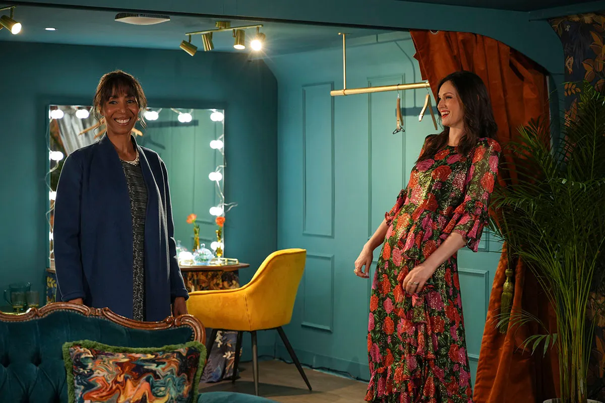
It's the semi-final! Time for our final three designers to raise their game by tackling VIP dressing rooms at Wembley.
Michelle asked the designers to create dressing rooms suitable for the stars, which also took into account their needs.
This week, Michelle was joining by a very special guest judge: popstar Sophie Ellis-Bextor!
It's going to be murder in the dressing room!
Ben
The designers had just two days to complete their transformations with a budget of £3,000. The dressing rooms were spacious (8x6m) with their own bathrooms. As usual, the designers had the option of keeping the furniture or spending their precious budget on new furnishings.
Matt was the only designer who opted to keep the Chesterfield sofa in his room, as he felt it was a classic piece of British design. Meanwhile, Roisin blew a third of her budget on some statement wallpaper.
Ben went for a glamorous Hollywood Regency era look, inspired by the styles of the 1930s. He made the brave (or foolish?) decision to make the entire room white to evoke the spirit of the era. He said he wanted it to look like a set that also functions as a dressing room.
Meanwhile, Matt chose to go for a more contemporary hotel-style dressing room. He made the dressing room the star of the show, with concrete-effect walls and green curtains to soften the look of the room. His copper ceiling leading the eye towards a circular mirror had real impact. Roisin admitted that she felt intimidated after seeing Matt's designs.
She needn't have worried though, because it was clear from her designs that Roisin had really taken Michelle's feedback on board from previous weeks. She chose a floral vintage theme with brighter colours than she's previously worked with, steering away from her trademark green paint. She cleverly sectioned off a changing area, so that the artist could have some privacy while their entourage were in the room.
"It feels like Roisin has finally cracked having a tight palette," Michelle said when seeing the room for the first time.
The judges felt less welcome in Matt's room, which Sophie Ellis-Bextor said felt very exposed. Unfortunately, his green curtains didn't do enough to soften the look of the room or dampen the acoustics. However, they were impressed by his stylish dressing table arrangement.
This is like walking into a ghost's dressing room
Sophie Ellis-Bextor, on seeing Ben's white dressing room
Ben's room took the judges' breath away when they walked in, but they immediately raised practical concerns. Sophie said that she would worry about dropping her makeup and making a mess, or that the white rug would get dirty.
They couldn't deny that his design was unforgettable, but was it functional as a dressing room?
The judges chose Roisin's room as Space of the Week. "You've created an absolute jewel box of a dressing room and you really showed me that you'd understood the brief," Michelle said.
Matt and Ben joined Sophie and Michelle on the sofa to discuss their designs and find out who would be leaving the show…
Highlights: Sophie compared Ben's finished design to Elton John's dressing room, which he must have loved! Sophie also revealed that she has gherkins on her dressing room rider when she's on tour.
Lowlights: While Ben stayed true to his vision, sadly Michelle and Sophie felt that the room wasn't practical or inviting enough for Wembley's biggest performers.
Episode 8 - the final!

It wouldn't be Interior Design Masters without a show-stopping final and you won't find many destinations that are grander than Blenheim Palace. You won't be surprised to learn that this was a filming location for Bridgerton.
Matt and Roisin were challenged to make over holiday lodges in Blenheim's majestic grounds. They were given a week to come up with their designs and were allowed to invite back a previous contestant to assist them in the final. Matt invited back Anthony, who left the show in episode six, while Roisin welcomed back expert upholsterer Jess.
Both finalists took inspiration from their surroundings, Matt was influenced by the grandeur of the palace interiors while Roisin based her design on Blenheim's grounds.
Matt set himself an ambitious challenge – he wanted the interior walls of his cabin to be completely smooth, a task that took a considerable amount of time on his first day. Roisin took a different approach – she covered the walls in paper to hide the cabin's grooves.
I had no professional design experience before the competition, so I didn't expect to get to the final. If I won it would be the best thing that's ever happened to me and I got married last year
Roisin
At the end of day one, Matt was feeling stressed by his lack of progress. "Everything does feel a bit of a concern to me ... I feel like we're starting on day one again tomorrow."
However, on day two he picked up momentum and got to work. He brought in some dark and moody shades, painting the master bedroom in a luxurious black with Baroque-influenced panels. His living room and kitchen were brighter, with softer furnishings thanks to Michelle's comments from the previous challenge.
Roisin went for a bold approach, filling her house with fresh colours. She decorated her living room in warm shades with a lively foliage-patterned wallpaper, teamed with yellow paint and pops of colour. Her inviting bedrooms were decorated with floral wallpaper, which also covered the ceilings.
Their finished lodges were complete polar opposites. Alan described Matt's design as "dark and brooding" in contrast to Roisin's design, which he said was "more like walking into Balamory than Blenheim Palace".
However, there were only two opinions which mattered: Michelle Ogundehin and guest judge Jonathan Adler, a New York potter and designer. And there could only be one Interior Design Master.
I want to merge you together and crown you both!
Michelle Ogundehin
Highlights: It was wonderful to see how both designers have grown since the start of the competition, with both keen to learn from the past feedback they'd received from Michelle and the judges.
Lowlights: Roisin panicking and making the decision to paint her kitchen units pink at the last minute. So stressful!
Who won Interior Design Masters 2024?

Roisin Quinn is the winner of Interior Design Masters 2024! Roisin's first taste of interior design was redecorating her parents' home and she never looked back.
Over the series, we've loved seeing Roisin grow in confidence and develop her own signature style, learning from the judges' comments each week.
She said: "I've done it! I've just won Interior Design Masters – I can't believe it. The whole thing has been the biggest achievement of my entire life."
Take inspiration from Interior Design Masters with our projects
Interior Design Masters series 5 is going to back you want to completely redesign your space.
Luckily for you, Gathered is full of fantastic interior inspiration. Whether it's kitchen cross stitch patterns or beautiful sewing room ideas, we have loads of projects and patterns to help you update your space.
Find more craft shows with Gathered
Now you've decorated your home you need some art to put in it! Discover some of the amazing art shows on air with our collection of the best Craft TV shows, such as The Great Pottery Throw Down!
